Quick Links
- Network Map
- List of Stations
- Monthly Report Card
- Quarterly Report Card
- Network Status Page
- Potsdam CPF time bias service
- Procedure for estimating laser beam divergence
- Recent Station Upgrades
- Network station application form
- Revised ILRS station screening process at ILRS Operations Centers (NASA and EDC)
How to Use Monthly Maps of Station Performance
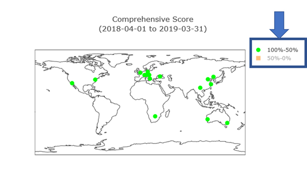
Each map depicts the station's assessment using different shapes and colors. The map below is for the Comprehensive stations score. A legend is included on the right of each map below the main title.
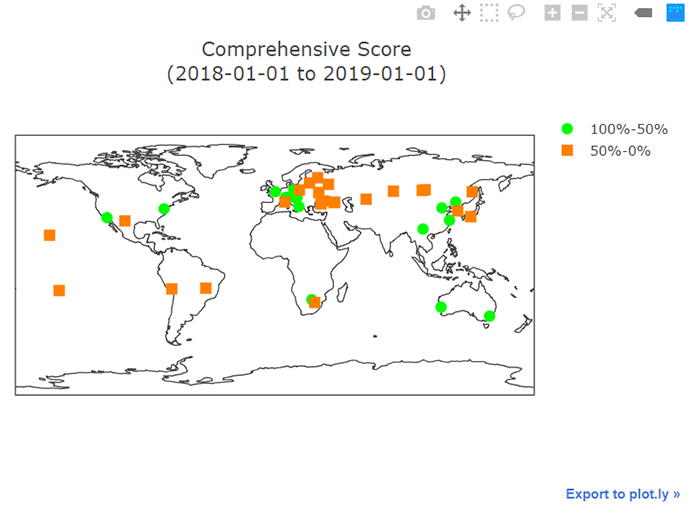
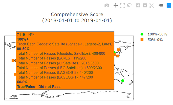
To obtain more information for a station, hover over the icon on the map with your mouse. See map below.
As you hover anywhere over the map with your mouse, a horizontal list of icons will appear above the main map title on the right (visible above). The functions these icons perform is as follows:
It is also possible to selectively view items on the map that are listed in the legend. Clicking once on an item in the legend causes those icons on the map to disappear. Double-clicking on an item in the legend causes everything other than the double-clicked item to disappear. The text in the legend for the non-appearing items will turn grey in both cases. See image below.