Quick Links
- Network Map
- List of Stations
- Monthly Report Card
- Quarterly Report Card
- Network Status Page
- Potsdam CPF time bias service
- Procedure for estimating laser beam divergence
- Recent Station Upgrades
- Network station application form
- Revised ILRS station screening process at ILRS Operations Centers (NASA and EDC)
Overview of Active Station Plots
The Station Plots Working Group was formulated by the ILRS Central Bureau to create new station charts based on the input of analysts, station personnel, general members of the ILRS and the Central Bureau. These charts allow station personnel, among others, to identify station systematics and errors more easily and will serve to motivate stations to improve their performance. Training may be necessary for station personnel to understand how to utilize these graphs.
The start date of most plots begins as early as 2012/05, when the CRD format was released.
General Tips for Using the Plots
- The plots allow users to zoom into a specific period by dragging and dropping over the plot. You can also use the slider below the plot.
- After zooming into the plot, double-click the plot to go back to a full view.
- To toggle on and off keys in the legend, select the key. An example is below.
Meteorological Plots
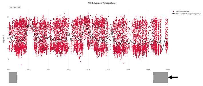
Since 2012 Plots
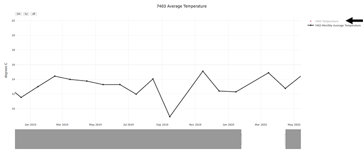
These plots provide the meteorological values which are used to calculate the tropospheric correction. For the station, large jumps in these values many indicate an issue with the hardware/software or exceptionally good/bad weather.
When users select a "Since 2012" plot, they can zoom into any period they prefer including the current year. This can be done by either dragging the mouse over the area of interest or moving the sliding range selector at the bottom, indicated by the black arrow.
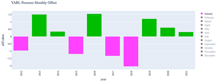
Monthly Offset Plots
The data displayed shows the currently monthly average minus the historical monthly average. These plots show variations around the new trend which can be used to identify equipment changes and hardware/software problems. This is especially important for pressure because the tropospheric refraction correction is extremely sensitive to barometric pressure. Because equipment changes are not always documented by a station, this tool will be useful to the analysts and stations by looking back to see if any meteorological offsets need to be documented in the ILRS Data Handling file.
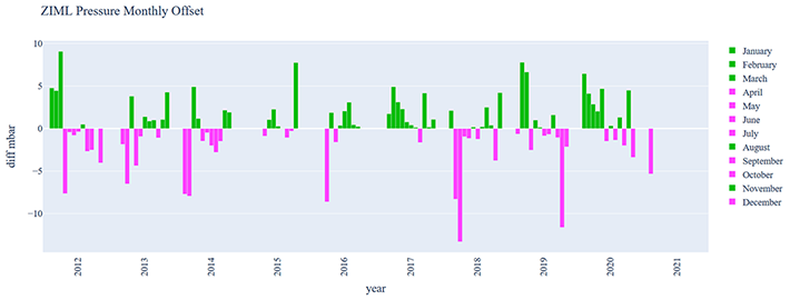
Users may choose to look at a specific month or season by clicking/toggling on the months in the legend.
LAGEOS plots
Since 2012
The "Since 2012" plots allow users to zoom into a specific period by dragging and dropping over the plot.
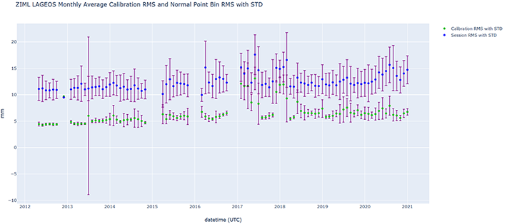
Monthly average plots
The monthly average charts provide a clearer view of the analysis work that can be done with the "Since 2012" graphs. They show how averages may be skewed by outliers due to the standard deviation shown. They also show if their session RMS tracks to their calibration RMS. Calibration RMSs that are higher than session RMSs is an indicator of a calibration issue. A large disparity between calibration RMS and session RMS also may indicate a calibration issue.
Station-Satellite Plots
A subset of all the satellites tracked are now being created in this section. The following satellites were selected:
- Altimetry: Jason-3 and Cryosat-2
- LEO: Grace-FO, Swarm
- ITRF Satellites: LAGEOS, Etalon, Lares
- Standard Targets: Starlette, Stela, Ajisai
- GNSS: Galileo, Glonass (selected from the most productive ones from last year)
These charts are used to gage the overall precision of the system. For the LEO satellites with high quality retroreflectors, there is no signal spreading from multiple signal returns. This allows stations to determine how far down they can get in their RMS based on range and time of day. With the SWARM satellites, the precision allows users to get information on the SLR system itself, reflecting the hardware performance of the station. Plots of the GNSS satellites may be used to form an idea of how long it takes to form a normal point that reaches 1 mm precision or 1000 observations.
Tracking Plots
The goal of these plots is to improve station productivity by providing statistics on weekly performance. Although these charts are influenced by weather and schedules at the stations, the primary goal is to provide a meaningful at-a-glance record of station tracking habits to guide panning of tracking schedules and improve station performance. This includes seeing if stations are meeting the minimum number of NPT per pass. In addition, users can see what highly productive stations are tracking and their habits.
Plots will be generated to show the last seven days of tracking, one plot for each day. The LEO, LAGEOS, and Etalon data show the start and end time of each session. GNSS satellites are displayed differently and show the NPT over time, grouped by hour.

- NASA Official: Frank Lemoine
- Web Developers: 610 Web Dev
- Contact Us
- Last modified date: Feb 4, 2021
- Privacy Policy & Important Notices